Jan 1, 2021

I finally put together a logo for The Painted Banana, and thought I would add a few pictures as well as some notes on the process to this here blog.
One idea for this design was to create a logo that would be simultaneously silly and serious. I say silly, because while absurd is closer to my actual intention, silly is the way that it will most likely be interpreted. This almost contradictory combination of concepts is rooted in my interest in surrealism, where subjects of the most absurd nature are sometimes presented in a very serious light. I am most interested in this form of presentation when it isn't done simply for effect. Absurd, or silly subjects are just as real to our lives as the blatant, banal and factual. So it only makes sense (to me at least) that the seemingly bizarre or ridiculous could be presented with the same serious reverence as other “Higher” ideas: iconic, political, religious, or allegorical subjects. To be clear, this isn't about mocking the status quo. It's just a matter of trying to see the world, cultures, and sub-cultures as they really are.
 The first step in my process was selecting fonts.
I wanted to find at least 2 fonts to use, each with the power to resurrect the feel of ornate Victorian logos.
The kind of font you might expect to see on a product with a name like “Dr. Brannagh's Delicious and Soothing Brightening Banana Beard Balm”.
The overall logo shape was to be banana-esque, crescent shaped but not symmetrical.
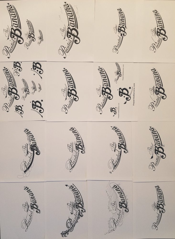
My plan for the process was to layout text in the computer, print it on heavy paper, then go to work with a pen or pencil on the printed page to see what I could come up with.
For the paper I used 60lb Hammermill which is a thicker paper/cardstock that prints nicely, and is excellent for direct pen and ink application.
 This was the first drawing, and much has changed since, but it did set the style for the rest of the process.
 I created several more variations, then started adding ideas that I liked as vector elements to the next print out, which I would then draw on.
You can see (above) that I started to think about elements from the logo that could be isolated for other design purposes.
I actually stopped myself, remembering (from experience) that it would be better to work through those details as needed.
I expect the logo to change over time, so it would have been a waste to spend too much time creating elements that might not be relevant in the future.
 The above was the runner up to my final version.
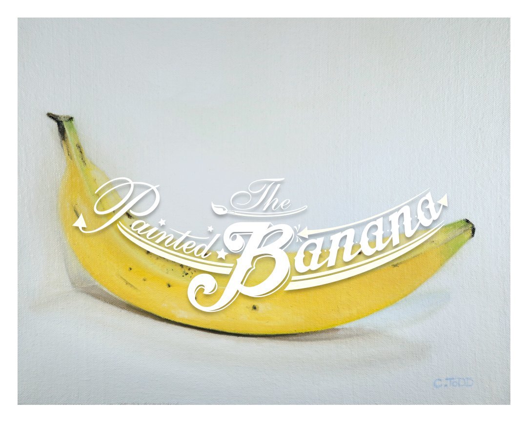
 And this is what I settled on for the final. I
have actually made a few changes and corrections since taking this photo. So, the overall shape is a Banana being peeled,
(which also resembles wings), the paintbrush is clear and central, the word painted
has some stars/sarcastic cartoonish sparkle. I settled on one redirecting arrow pointing back to the B with a gesture that
I hope will resonate as an audible “BOINK” in the mind of the viewer.
The little triangular tails are mostly there because as a kid I though they were "cool",
but also as a reminder (at least to me), that the absurd is usually associated with the devilish.
As previously mentioned, I expect the logo to change over time, so rather than changing the things that still bother me about it...
I'll change them when the time is right to do so.
 And there we have it.
I can now add water marks to images, branding wherever I please.
And, if I'm fortunate to sell some products with my images on them,
I can clearly brand some simple packaging and thank you notes.
The Painted Banana Gallery >>> http://www.thepaintedbanana.com
~Cory